Evaluating both usability and user experience in VR
The primary goal of this study was to go beyond simple task completion. I wanted to understand how users navigate immersive environments and how VR impacts them physically and emotionally.
In spatial systems, it isn't just about "can users do it"—it's about how the experience feels.
Study Setup
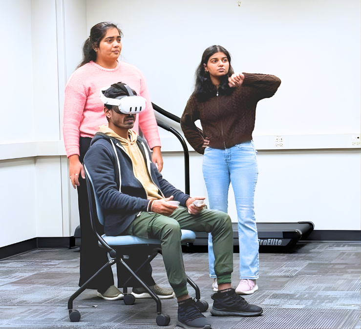
MethodologyMeta Quest 3
Wander VR
3 users with varying levels of VR familiarity.
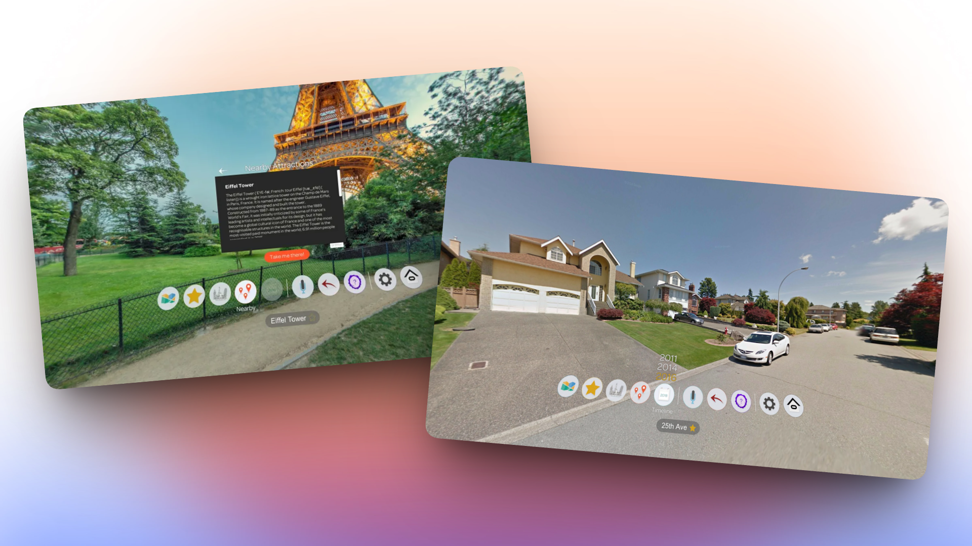
- 1. Select a location directly from the map.
- 2. Find a meaningful location (e.g., hometown).
- 3. Use random teleportation to explore new places.
Users could complete tasks, but struggled with the experience
SUS Score (Below Average)
SSQ Findings
Users felt disoriented
Key Usability Challenges
- • Difficult Navigation: Unclear map interface, lack of zoom, and unstable pointers.
- • Lack of Context: Disorientation after teleportation; no clear indicator of location.
- • UI Proximity: Interface elements were often too close to the face, causing cognitive fatigue.
"The search window is on my face, it's hard to remove it."
"The map... lacked details. I could only choose a location and go there."
The finding we didn't expect
Task 2 asked participants to search for somewhere personally meaningful to them. For P3, an international student, that meant searching for her hometown in India. We weren't prepared for what happened next.
"This is my home... woww amazing. I don't know when this picture was clicked, but if my dog was outside then you could have seen my dog."
She recognised her own house. She started looking for her dog. The task was basically forgotten at that point. She just wanted to explore. It was one of those moments where you stop taking notes and just watch.
User Study Observation
Usability alone does not define VR experience
Even with usability issues, emotional connection increased engagement. Familiarity created immersion, and personal relevance made the experience meaningful.
Design Recommendations
ExecutionTo reduce confusion and improve comfort:
Micro-onboarding
Add a short 10-15 sec tutorial for spatial calibration before the session begins.
Spatial Feedback
Introduce haptics and improved teleportation visuals to build user confidence.
UI Placement
Adjust default window distance to match personal space expectations and reduce fatigue.
To support immersion:
Smoother Transitions
Reduce abrupt camera movements to minimize motion sickness and disorientation.
Enable Personalization
Support emotional exploration via saved, meaningful locations that build a sense of presence.
Reflection
This study changed how I think about user experience. I learned that patterns observed in VR translate to all intelligent systems:
- • spatial interactions must match real-world expectations
- • feedback is critical for user confidence
- • emotional moments define the success of a product