Rebuilding
Trust
Redesigning Craigslist to restore trust and improve usability in a marketplace that everyone recognises but nobody fully trusts
Redesigning Craigslist to restore trust and improve usability in a marketplace that everyone recognises but nobody fully trusts
Craigslist is one of the most visited websites in the US. It's also one of the most distrusted. People don't avoid it because the prices are worse than Facebook Marketplace or OfferUp. They avoid it because it doesn't feel safe. That's a design problem.
This project started with a simple question: what would Craigslist look like if it were rebuilt today with trust and usability at the center, while keeping the raw, no-frills character that made it useful in the first place?
 My Role
 The Core Question
What would Craigslist look like today if it were rebuilt with trust and usability at the center — without losing the simplicity that made it work?
Before sketching anything, I audited the current interface against Nielsen's 10 Usability Heuristics. The problems weren't subtle. Three stood out as critical enough to shape the entire design direction.

Walls of tiny text with no visual hierarchy or breathing room. Users have to work to extract basic information from every listing.

Hundreds of categories with no logical grouping. Users either know exactly where to look or get lost immediately.

Complete anonymity at every step. No profiles, no verification, no accountability. The platform creates the conditions for fraud rather than preventing them.
Error Prevention
The system allows anonymous posting with no verification, creating conditions that are easy to exploit for fraud.
Eliminate the error-prone condition via verified profiles and optional ID checks.
CriticalAesthetic & Minimalist Design
Irrelevant links and visual clutter compete with listings. Poor signal-to-noise ratio throughout.
Remove distracting elements. Prioritise image and price as the primary scanning anchors.
FailConsistency & Standards
No standard visual hierarchy. Users can't distinguish between headers, links, and body text at a glance.
Adopt a consistent typographic scale that matches user expectations from modern web interfaces.
WarningCraigslist's trust issues have been widely reported. I reviewed articles covering scams, safety incidents, and the platform's declining relevance against competitors who have made safety a core feature. A few consistent themes kept coming up.
The pattern across all of it: people aren't leaving Craigslist because it's too expensive or too niche. They're leaving because it makes them feel like something bad could happen and there would be no recourse.
Rather than designing for an abstract user, I built a persona grounded in a realistic scenario: someone who needs Craigslist to work, but has every reason to distrust it.
I benchmarked Craigslist against Facebook Marketplace, OfferUp, and eBay to understand what features modern users now expect as standard. The gap was clear.
Facebook Marketplace


OfferUp
eBay
Craigslist

Every competitor has built some system of accountability. Craigslist is the only major platform that remains almost entirely anonymous. That's not a feature. It's the gap.
The goal wasn't to turn Craigslist into eBay. Craigslist's raw, utilitarian character is part of what makes it distinctive. The strategy was to add the two things it genuinely lacks — usability structure and trust infrastructure — without over-designing everything else.
Pillar 01 — Usability
Pillar 02 — Trust
Rather than redesigning every surface, I focused on the three moments where the current experience loses people: arriving on the homepage, browsing listings, and deciding whether to trust a seller.
Screen 01
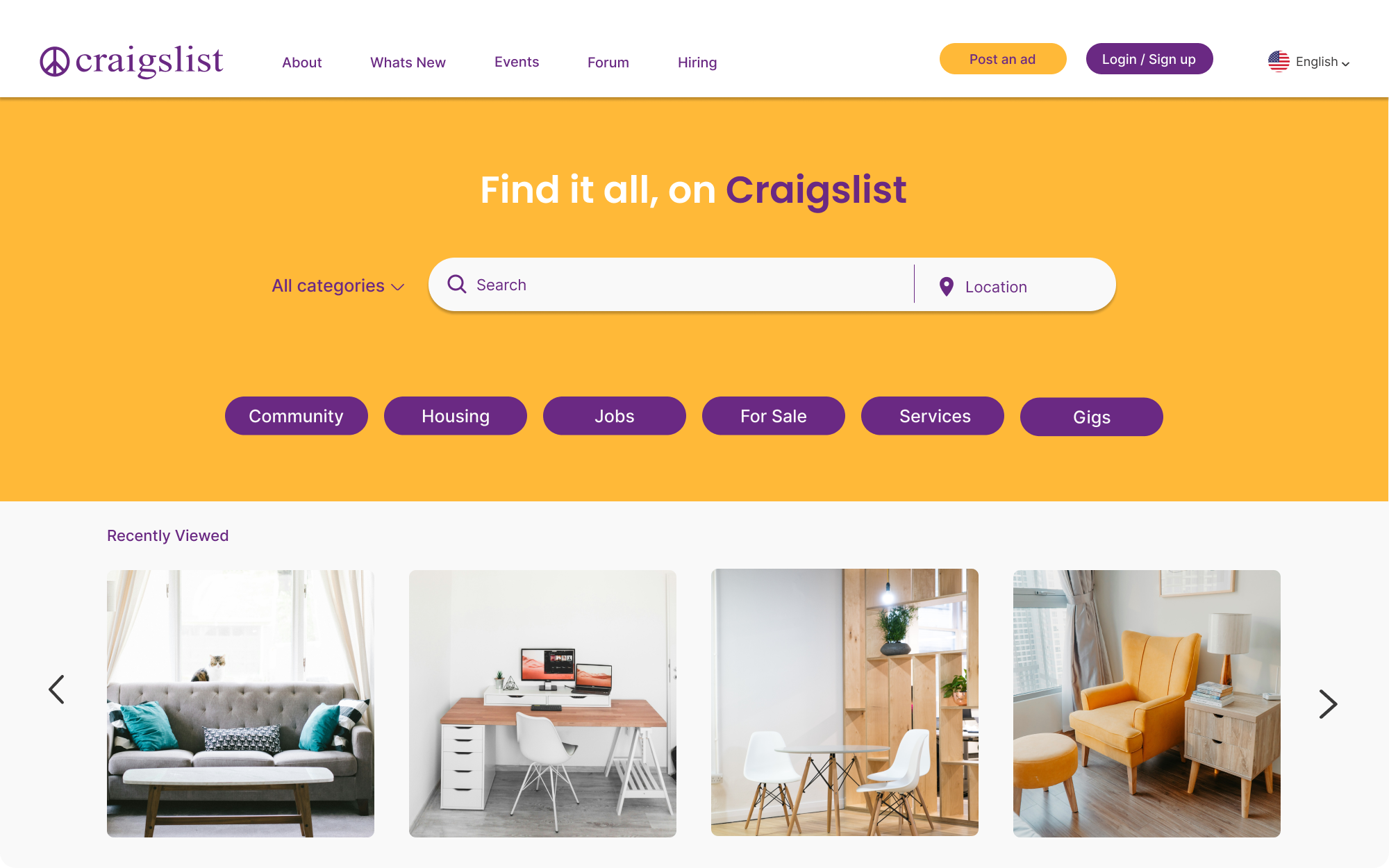
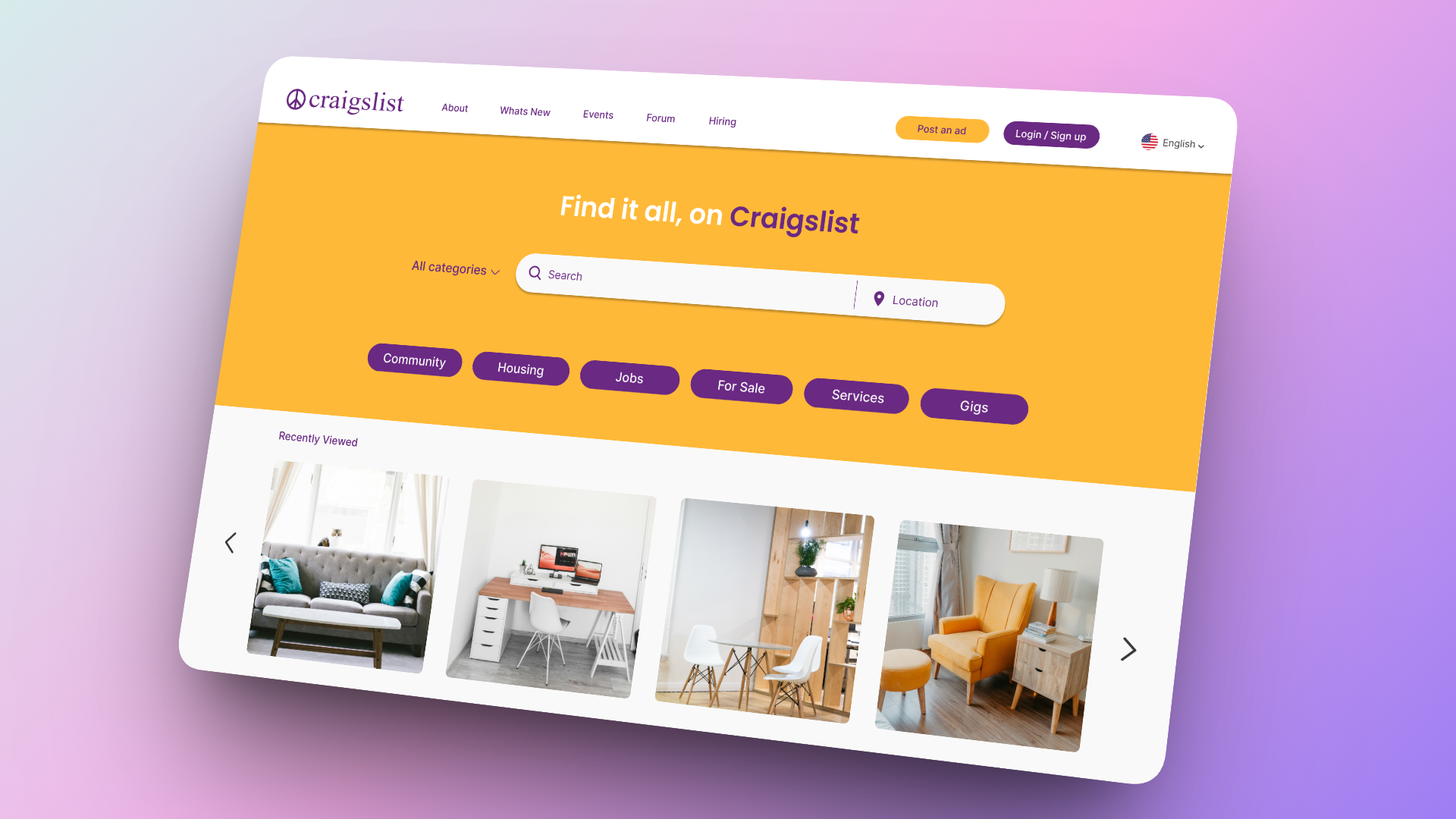
The homepage keeps the familiar directory structure but introduces visual hierarchy through grouping, clear headers, and intentional whitespace. It still feels like Craigslist, just one you can actually read.

Screen 02
Listings now surface image, price, condition, and location upfront. A Verified Seller badge appears directly on the card, so trust assessment happens before the click, not after.
Screen 03
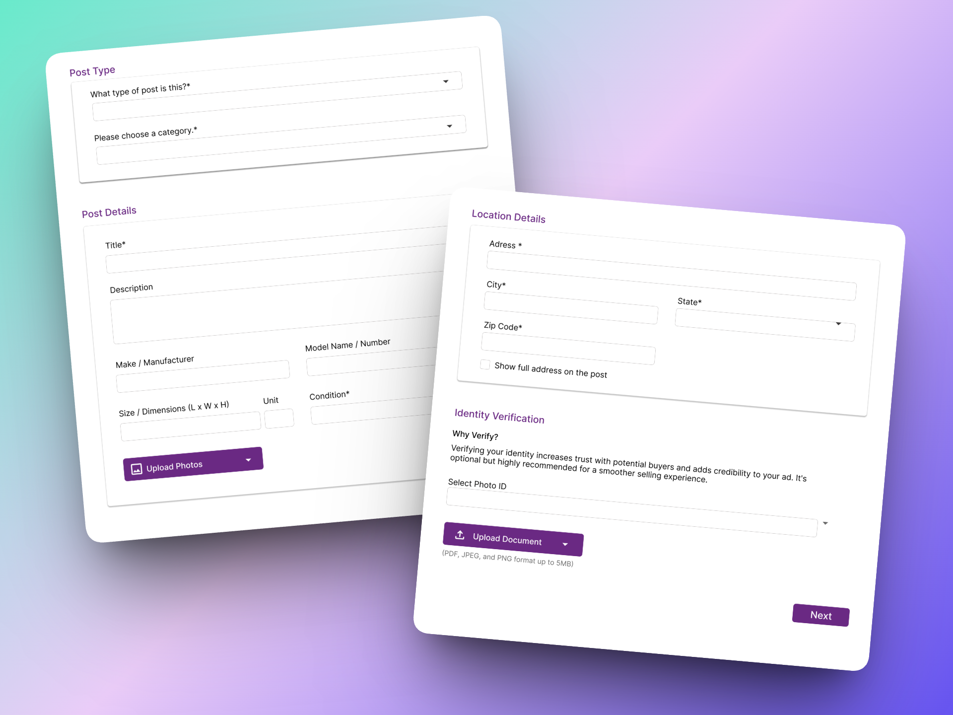
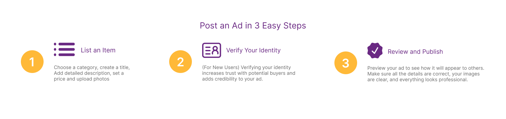
A 3-step flow for earning the Verified badge. Connecting a phone number or social account creates accountability without requiring complex ID documents. Short steps reduce abandonment.
Testing was informal and qualitative. Three participants walked through the redesigned screens and gave their reactions. The feedback was consistent across all three and pointed in the same direction.
That last one was the most important to hear. The goal was never to turn this into a generic marketplace app. Participant C noticing that it still felt like Craigslist meant the redesign kept what was worth keeping.
The three screens address the biggest gaps, but two additional features would meaningfully extend the trust work without requiring a full platform overhaul.
Redesigning something with 20 years of history and a loyal user base is a different kind of problem than designing from scratch.
01
Adding a "Verified" badge isn't enough on its own. Users need to feel safe at every step — through transparent communication, consistent feedback, and design that signals accountability before it's needed.
02
Craigslist's directness is genuinely useful. The temptation in a redesign is to modernise everything. The harder skill is figuring out what not to change and why the original made sense.
03
The fear of being scammed isn't solved by a better filter sidebar. It's solved by design that addresses the anxiety directly, at the moment it's most acute, before the user has to ask for reassurance.
